# oh-knob - Knob & Rounded Slider
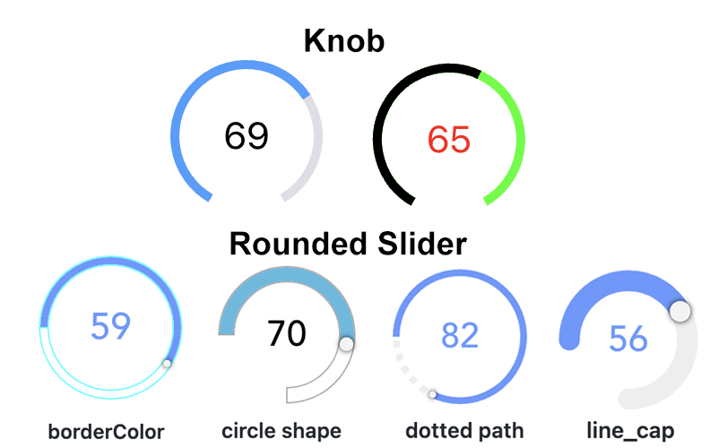
Allows to change a number value on a circular track or a rounded slider
# Configuration
Use the advanced properties to change the appearance from a knob to a rounded slider.
# General
# item Item TEXT item
Item to control
# min Min INTEGER
Minimum value (default 0)
# max Max INTEGER
Maximum value (default 100)
# step Step DECIMAL
Minimum interval between values (default 1)
# offset Offset DECIMAL
Offset to be applied to the Item's state (e.g. Item state = 2; offset = 20; knob/rounded slider behaves as Item state would be 22)
# ignoreDisplayState Ignore Display State BOOLEAN
Ignore the display state if available and always use the raw state.
# releaseOnly Send command only on release BOOLEAN
If enabled, no commands are sent during sliding
# commandInterval Command Interval INTEGER
Time to wait between subsequent commands in ms (default 200)
# delayStateDisplay Delay State Display INTEGER
Time to wait before switching from displaying user input to displaying Item state in ms (default 2000)
# disabled Disabled BOOLEAN
Disable the slider (usually set via an expression since the value will not be displayed when disabled)
# size Size INTEGER
Visual size of the control in px (or % if responsive is true)
# responsive Responsive BOOLEAN
Size the control using percentages instead of pixels
# strokeWidth Stroke Width INTEGER
Thickness of the arcs (default 18)
# startAngle Start Angle INTEGER
Angle of circle where the round slider should start (default -50); 0 is 9 o'clock; only if circleShape is not set
# endAngle End Angle INTEGER
Angle of circle where the round slider should start (default -130); 360 is 9 o'clock; only if circleShape is not set
# lineCap Line Cap TEXT
Sets the shape of the end of the path; dotted path and line cap cannot be used together.
Options:
# dottedPath Dotted Path TEXT
Length of dotted path segments (using css stroke-dasharray); dotted path and line cap cannot be used together.
# borderWidth Border Width INTEGER
Sets the border width of the slider (px value)
# handleSize Handle Size TEXT
Sets the size of the slider handle (px value)
# borderColor Border Color TEXT
Sets the border color of the slider; set borderWidth as well! (HTML value)
# pathColor Path Color TEXT
Sets the path color of the slider (HTML value)
# rangeColor Range Color TEXT
Sets the range color of the slider (HTML value)
# tooltipColor Tooltip Color TEXT
Sets the tooltip color of the slider (HTML value)
# variable Variable TEXT
Name of the variable to set on input change
# variableKey Variable Key TEXT
Consider the variable value is an object and set the corresponding deep property within that object using a key syntax. Examples: user.name, user[0].address[1].street, [0], [0].label. The inner property and its parent hierarchy will be created if missing.
# Inherited Properties
Properties are forwarded to the underlying vue-round-slider (opens new window) component, which means you can set these parameters (opens new window). A compatibility layer ensures backward compatibility with the vue-knob-control (opens new window) component that was initially used.